Overland Park Church of Christ's
Web Site
We suggest that you visit Overland Park Church of Christ's site and tour around it for a while. Then come back and read the review. Feel free to write us with your comments or criticisms at feedback@hartsem.edu.

 Note: This site has been redesigned since its review in August of 2000. Note: This site has been redesigned since its review in August of 2000.
Review: We were immediately attracted to this site's home page. Its warm, soft look has an appealing and inviting quality.
Overall, the site has a consistent, clean and uncluttered look. The subtle coloring is pleasant and the font and graphics style complement nicely. Together these convey a warm, friendly feeling to the site.
The site's navigation is very clear and organized. The layout of pages is logical and mostly intuitive. The site employs a well designed navigation bar with attractive sub-section graphics for displaying associated sub-headings. It also makes good use of text tags with its graphics.
The site uses very few images, but those that are used add interest to the pages. For example, the boxed scriptural quotes are a very nice touch, breaking the monotony of text pages without overwhelming or distracting from the content. We also thought the floor plans of the church, although a bit too large, would be of great help to a prospective visitor.
We had no problem finding necessary contact information, meeting times, email links, pastoral staff names and duties, or a statement of beliefs. This latter page even includes an offer of additional free information about the church's beliefs - an offer which could easily be delivered online with a .pdf file. meeting times, email links, pastoral staff names and duties, or a statement of beliefs. This latter page even includes an offer of additional free information about the church's beliefs - an offer which could easily be delivered online with a .pdf file.
The use of technology is subtle, but is employed nicely to increase congregational communication through an email newsletter, and attractive online newsletter for parents of youth in the church, and a convenient way for members to keep in touch by email with the church's missionaries in Costa Rica, Ecuador, and Thailand.
We have very little constructive critique of the site. Overall, the soft, inviting look of the front page was directly responsible for us choosing to review this site. At the same time, we think that the contrast between the text and the background throughout the site could be a bit more pronounced. This would especially help when trying to print a page of the site.
While the balance between text and white space is good, the longer text documents might be enhanced by more paragraph breaks, bulleted lists, and "up" buttons. Certain text sections, e.g. the ministry profiles section, could make greater use of live email links.
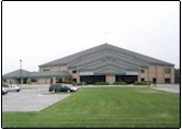
Finally, it took us a while to find a picture of the church on the web site. For a potential visitor, a glimpse of the building one plans to attend could be worth a thousand words of direction.
Even in the cyber reality of a congregation's web site, we cannot forget that this site represents a real gathering of believers and a tangible place - a photo brings that to life.
|